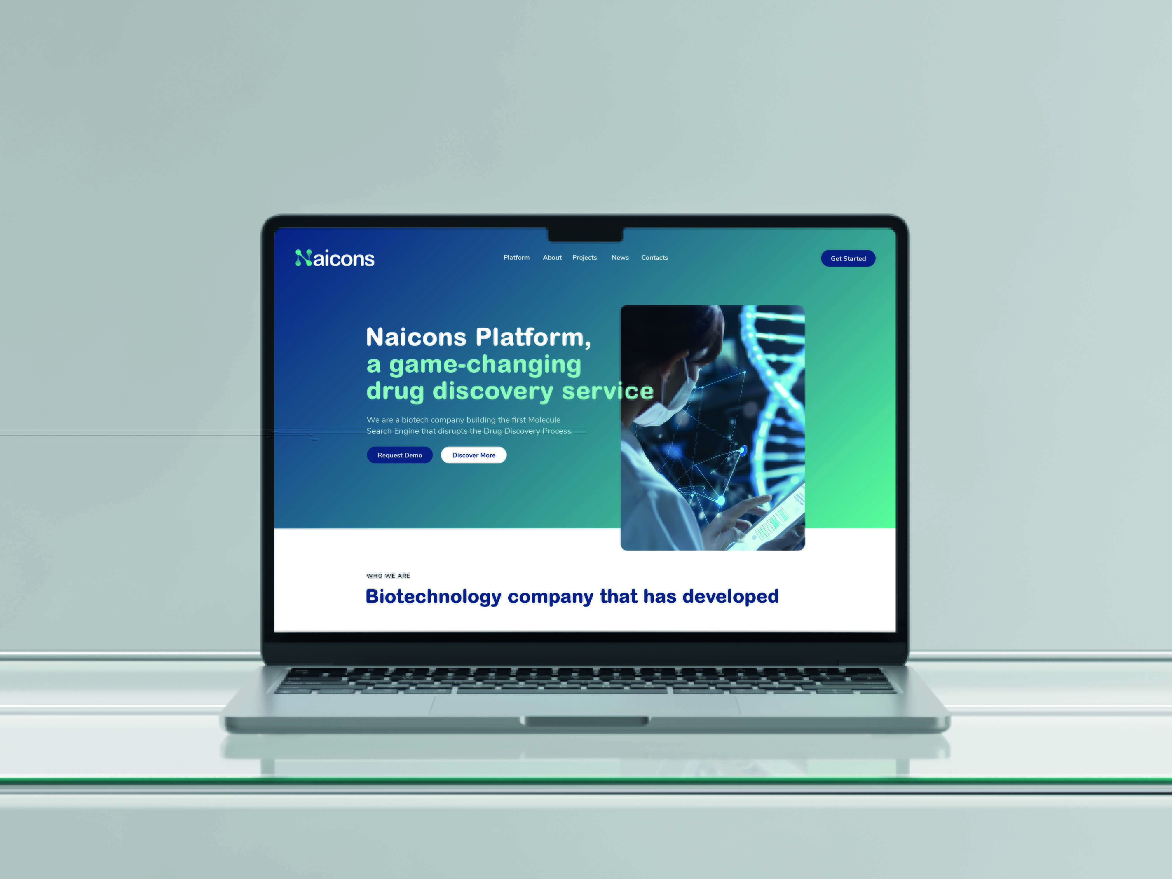
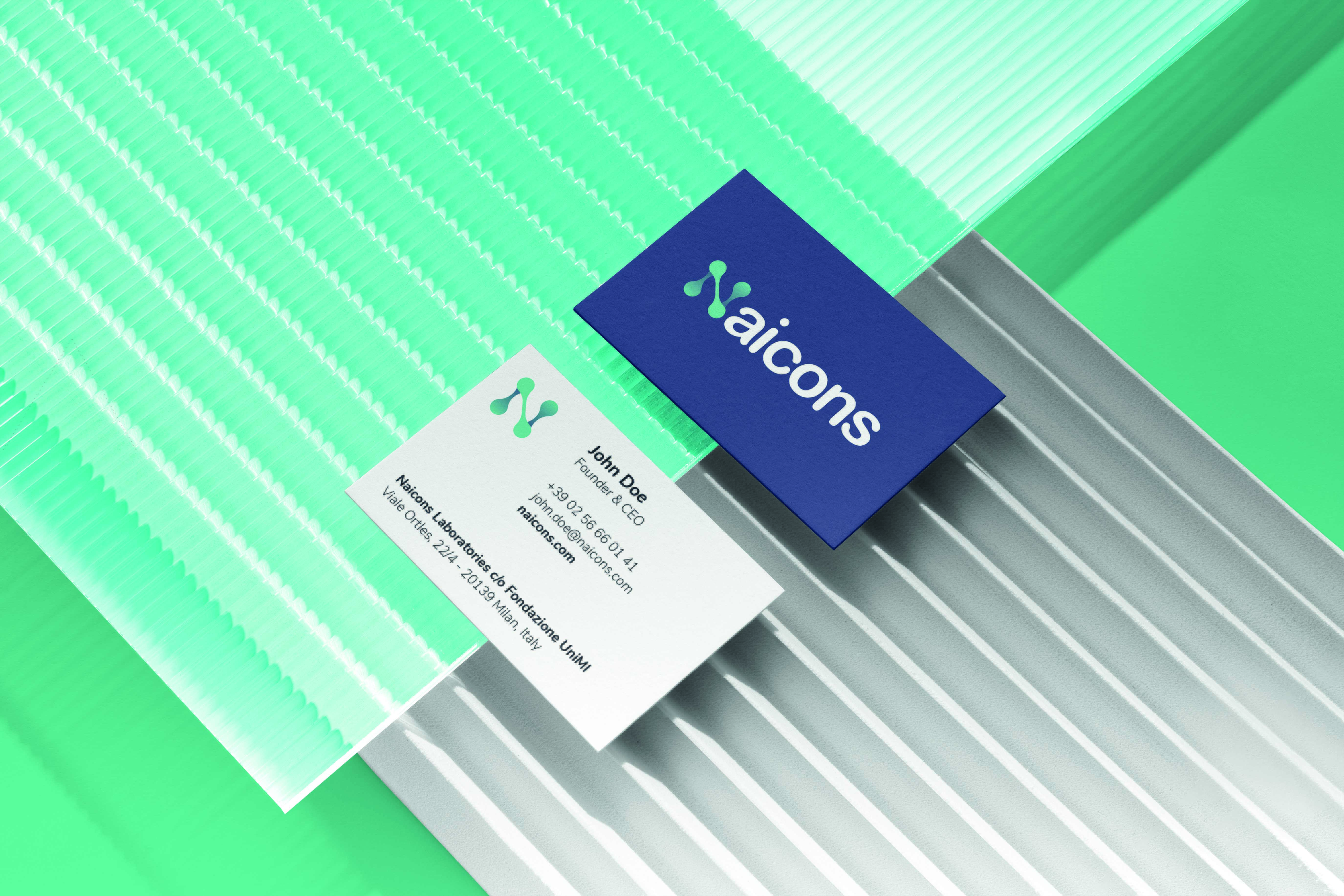
The Naicons rebranding represents a leap into the future, merging scientific precision with a contemporary design aesthetic. Our approach was to create a brand identity that is both innovative and reflective of the company’s core mission: redefining the process of drug discovery.
At the heart of Naicons’ new identity is the molecule-inspired "N," a key element that bridges the scientific and the modern. Using a sinuous and dynamic design, we crafted a logo system that combines a distinctive gradient with the rounded Arial MT Pro typography, ensuring flexibility and adaptability across all platforms.
The rebranding extended beyond visuals, incorporating a cohesive communication strategy and application guidelines. The color palette, with its blend of Naicons Blue and Green, echoes the company’s roots while embracing a digital-first approach. Every detail, from the typography to the monogram, was designed to elevate the brand’s presence in the tech and scientific arenas.