Valt, a leader in paints and building systems, exemplifies the power of design in redefining a brand's perception and market positioning. Through a strategic rebranding process, the company redefined its visual and communicative identity, positioning itself as a leader in innovative and sustainable solutions for a broader and more qualified audience.
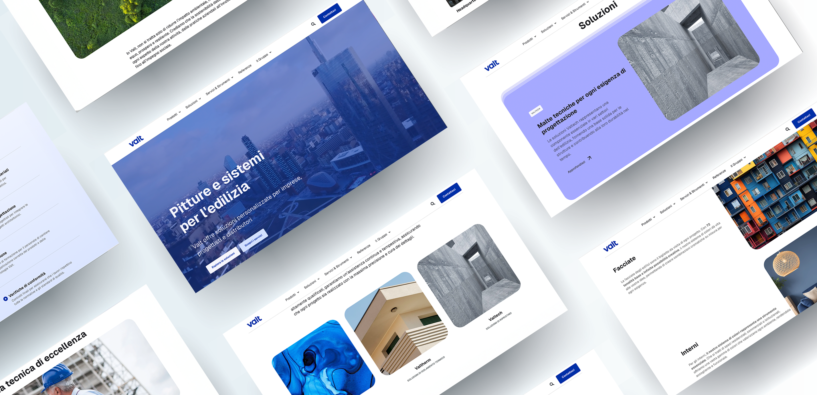
The project for Valt aimed to evolve the whole brand’s communication strategy. The focus shifted from solely addressing applicators to adopting a more sophisticated narrative, capable of engaging architects and designers. This transformation not only expanded the target audience but also elevated the brand’s perception, establishing it as a symbol of authority and innovation in the industry.The visual identity was redesigned to ensure strong recognizability while maintaining a connection to the brand’s heritage.
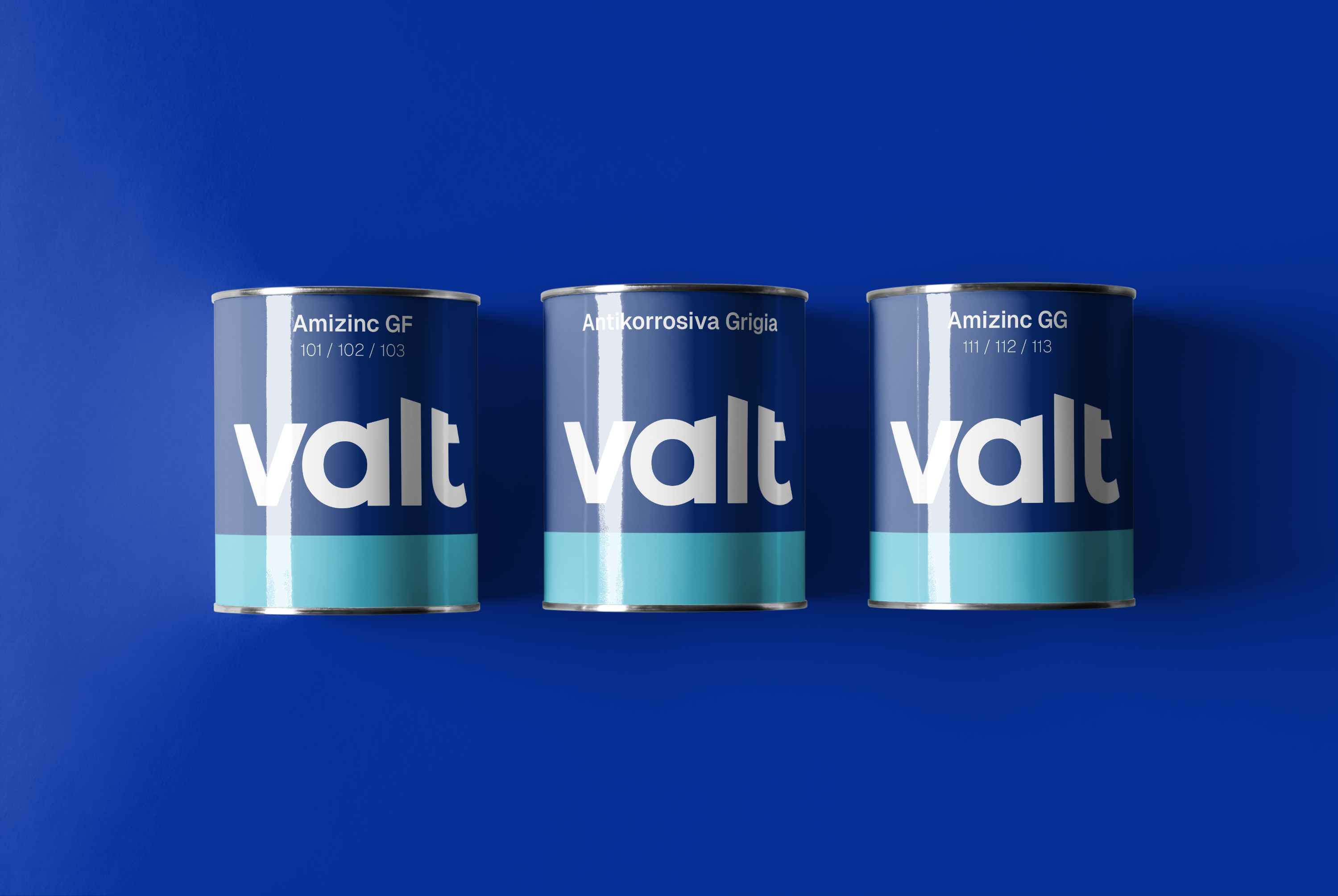
The new logo incorporates geometric oblique and vertical shapes, conveying modernity and dynamism, while Klein blue was chosen as the primary color to reinforce associations with reliability and innovation.
A key aspect of the rebranding was the meticulous attention to typographic details. A sans-serif typeface inspired by Swiss design was selected for its readability and versatility. This choice enables consistent application across different channels, from web to packaging, ensuring a professional and contemporary image at all times.